PRESS
INTERNATIONAL IN-STORE DESIGN SECRETS
February 5, 2018
In-store design is a major influencer of consumer purchasing decisions but finding the right visual strategy isn’t always easy. Talia Paz scours the globe in search of jewellery stores with the X factor.
What are consumers seeking when they enter a jewellery store? Aside from the obvious assortment of product, consumers expect to enter an environment that reflects the attributes that the business ‘stands’ for. A combination of the look, feel and smell of a store arguably plays a large role in helping to make a customer feel comfortable and ultimately make a purchase. The word ‘experience’ is thrown around a lot but surely for good reason.
Kevin Linberg, head of design at global retail design agency Sheridan & Co, says telling the business’ story in a clear and compelling way is critical to making a solid first impression.
“Consumers expect to enter an environment that reflects the attributes that the business ‘stands’ for.”
“Your brand needs to be reflected in the design and visual merchandising,” Linberg states. “A strong and inspired design language that considers the use of materials, motifs and lighting will establish what makes your brand unique and will communicate this to customers.”
Sheridan & Co retail strategist Alice Bodkin believes jewellers should factor in the important role emotion plays within the consumer journey.
“How does the brand want the consumer to feel? Excited, uplifted, educated?” Bodkin asks. “By reflecting upon this, the retail space can be created to achieve an emotive context that nurtures a memorable and lasting impression.”
Carol Bagaric, founder of visual merchandising consultancy Carol B, has similar sentiments. “As a jewellery purchase is often made with the heart and not the mind, it is imperative that the environment within a jewellery store speaks to this type of purchasing behaviour,” Bagaric says.
“Lighting, seating, ambience, store fit out, layout, graphics and signage – and staff! – should all be conducive to entertaining and indulging the customer as they make some of the biggest and most emotional purchases of their lives. It’s a special purchase and a very personal one; therefore, the store should reflect this type of environment.”
On that note, Jeweller has collated some of the world’s most intriguing jewellery stores and asked those involved in the design to shed light on how it has been used to create a shopping environment that leads to sales. Not all retailers will have the budget for a major store revamp; however, there is certainly value in gaining inspiration and analysing where potential improvements could be made, even if that simply means giving the walls a fresh coat of paint.
JEWELLERY STORES WITH THE X FACTOR
Denovo Diamonds

Name: Caryll Martinez
Position: Creative director, Denovo Diamonds
Country: Philippines
When did the store open?
The Denovo Diamonds flagship store opened in June 2016.
Who is the target market and how did they influence the store design?
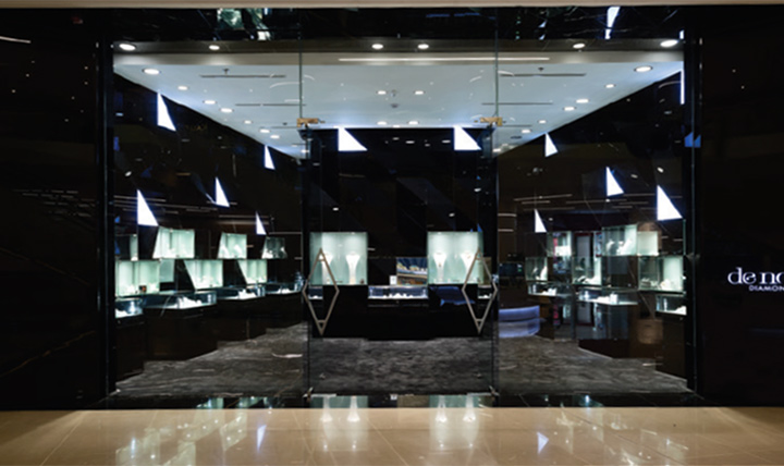
Our target market is men. Specifically, men who buy jewellery for women, whether it is for proposals, weddings or anniversaries. Denovo Diamonds developed a unique store design that is sleek and architectural so that men passing by would gravitate towards our store and would not feel intimidated when they walked in. We don’t want just to sell product; we want consumers to have a memorable experience.

With the relationship between store ambience and consumer purchasing in mind, which features in the store encourage sales?
Denovo’s store design deviates from the natural norm of a jewellery store where one would find its staff behind glass counters. This little change allows more interaction between the customer and our jewellery consultants, making the sales process less overwhelming. There is a consultation area at the back of the store where clients can sit in privacy. We also see diamond jewellery as comparable to art in that the jewellery is displayed and laid-out in a way that resembles an art gallery, contributing to our very unique and luxurious store ambience.

What is the store design’s ‘wow’ factor?
The definite ‘wow’ factor in our store is the three-dimensional walls that have black glass mounting with white, triangular light boxes. These resemble the facets of a diamond and the black glass accents the white showcases to draw the consumer’s eye to the products.
